
Craigslist Redesign
RATIONALE
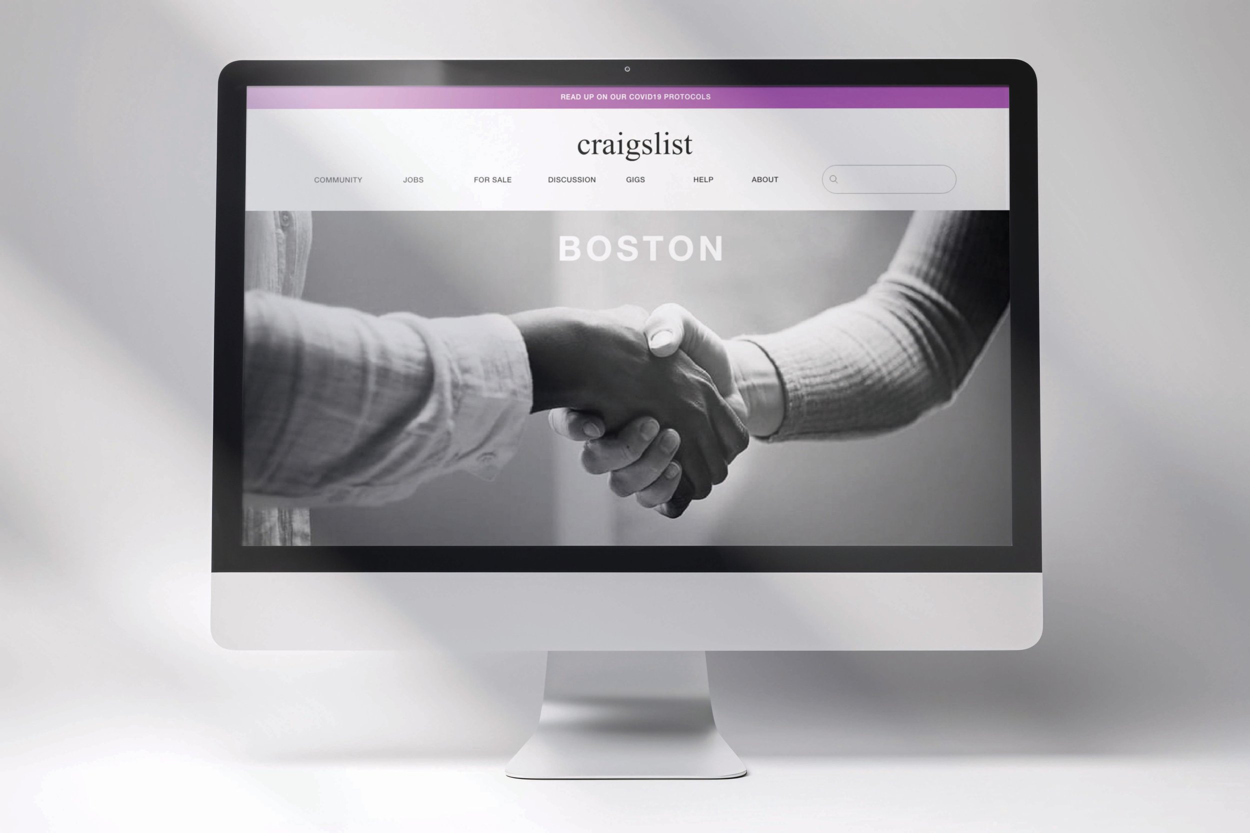
This website redesign for Craigslist involved reorganizing the site’s information into a clear, cohesive, and user-friendly design. The goal was to simplify the website, keeping it in line with Craigslist’s mission of simplicity, humanity, and inclusivity. By categorizing links into dropdown menus, the redesign aimed to declutter the homepage and create a more modern and user-friendly experience.
THE TEAM
My peer, Sydnie Drezek, and I collaborated on this project, sharing responsibilities across the research, concept development, and implementation phases.
COMPREHENSIVE VIDEO WALKTHROUGH
-
Adobe XD
Mural
-
8 weeks
-
Redesigned Wesite
PHASE 1: RESEARCH
~~~~~~~~~~~~~~~~~~~~
-
Craigslist is a free website where users can post and view local advertisements in the area.
The site has major usability problems and has been noted by many as not pleasant to use.
-
A user research study conducted in late 2019 revealed that our audience expects clear access to information, resources, and direct paths to reach their intended destinations.
Our users, ranging from 16 to 60 years old, come to our site to browse auto sales, home rentals, and event tickets, both as buyers and sellers. Alongside serving our visitors, we will also prioritize search engine optimization.
-
By looking at other competitors, we can more accurately determine what areas Craigslist is lacking or succeeding in. For this project, we looked at Facebook Marketplace and OfferUp.
PHASE 2: CONCEPT DEVELOPMENT
~~~~~~~~~~~~~~~~~~~~~~~~~~~~~~~~~~~~
-
Site Map Takeaways:
The "About" section lacks historical context and instead just links out.
The "Resumes" section is misplaced at the homepage bottom and doesn't need dropdowns.
The footer and secondary navigation contain redundant links (e.g., "Terms of Use" and "Safety Tips" appear twice).
The homepage is cluttered with excessive hyperlinks; adding dropdown menus could help organize sections better.
-
We conducted a user test on the site in its original form, involving five different users. Here is the final heuristic evaluation of the results:
-
From the results of our user tests, we rougly sketched out what an ideal homepage would look like for Craigslist.
~~~~~~~~~~~~~~~~~~~~~~~~~~~~~~~~~~~~
PHASE 3: DESIGN IMPLEMENTATION
-
Based on our research, we conducted an in-depth analysis to determine Craigslist’s essential elements versus those that could be removed. Our redesigned site features a cleaner, more modern layout with organized content and significantly reduced clutter.
-
The final!